LabVIEW UI Trick: Panel Wallpaper
Do you ever get tired of the gray panel background color?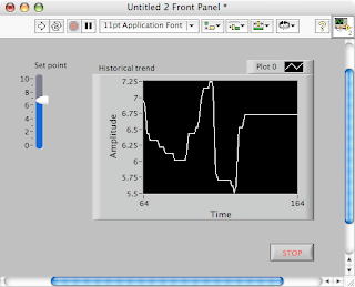
Before LabVIEW 8.20, you could put background images in VIs, but they got in the way while editing and you had to make sure they were just the right size.
In LabVIEW 8.20, you can set wallpaper for your panel. Right-click on the scrollbar and select "Properties." (I know, this is an odd place for it, but we couldn't make it a right-click on the panel, could we?)
From the Pane Properties dialog, you can choose from several shipping Background images, or browse to your own. You can set the image to Stretch (grow to fill the panel), Center (stay at a fixed size in the center of the panel), or Tile (repeat the image to fill the panel).
Here's our panel again, but with a brushed metal background:
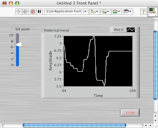
And, in case you're wondering, the "Pane Properties" is not a misprint. For normal VIs, there is one pane that fills the panel, but by using the Splitter Bars, you can have multiple panes in a panel.
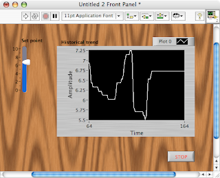
That's all for now. Have fun! But please don't go too crazy. Eye candy is fun where appropriate, but you don't want to make something ugly and difficult to use:

Before LabVIEW 8.20, you could put background images in VIs, but they got in the way while editing and you had to make sure they were just the right size.
In LabVIEW 8.20, you can set wallpaper for your panel. Right-click on the scrollbar and select "Properties." (I know, this is an odd place for it, but we couldn't make it a right-click on the panel, could we?)
From the Pane Properties dialog, you can choose from several shipping Background images, or browse to your own. You can set the image to Stretch (grow to fill the panel), Center (stay at a fixed size in the center of the panel), or Tile (repeat the image to fill the panel).
Here's our panel again, but with a brushed metal background:

And, in case you're wondering, the "Pane Properties" is not a misprint. For normal VIs, there is one pane that fills the panel, but by using the Splitter Bars, you can have multiple panes in a panel.
That's all for now. Have fun! But please don't go too crazy. Eye candy is fun where appropriate, but you don't want to make something ugly and difficult to use:

Labels: user_interface

9 Comments:
Traitor! Sacrilege! Those are MAC screenshots... j/k.
Nice tip, but VERY scary. Instead of inheriting pink backgrounds, I will one day likely inherit "brushed metal" backgrounds... Lets hope everyone notices what was wrong with the last example!
If I look into the Symfac1 application (NI\shared\graphics), their are a lot more backgrounds under textures, bricks, chain link fences amongst other
Matt,
At least now when you inherit a VI with wood-grained background, you'll immediately know how to get rid of it. :-)
I actually blogged this because someone came to me with a VI where he couldn't figure out how to get rid of a stretched background image. Without knowing about the pane background, he thought it was a mysterious, unselectable image.
- Christina
ton -
I had forgotten about the Image Navigator. Thanks for pointing it out! I hope no one tries to use the "Pizza, no mushrooms" texture as a VI background, though. :-)
- Christina
Your "ugly" example looks suspiciously like my post to LAVA in Jan 2004 that lead to some requests for this feature.
http://forums.lavag.org/Retro-User-Interface-t133.html
alan,
I hadn't seen that LAVA thread, so any resemblance is purely coincidental. The wood-grain in your VI is a much better background than the one I used, since it is finer-grained. (You'll notice I bolded the text on my example and it's still nearly illegible).
I hope I didn't offend you! I didn't mean to imply that I'm always opposed to textured backgrounds. I'm just opposed to inappropriate textured backgrounds, i.e. ones that are used for no good reason and reduce the overall usability of the interface.
I wasn't offended. The VI that I made a few years ago was just an attempt to push the GUI to look un-LabVIEW. Now I can be really dangerous with this wallpaper feature. Thanks for the execellent blog.
Yes, the wallpaper feature is definitely... dangerous. :-)
Thanks for reading!
Ah, another tool for the obfusicated LV project... put wallpaper on the FP that looks like the block diagram, and then just make the block diagram a gray rectangle like the front panel. :-)
Post a Comment
<< Home